
It’s All Black & White: Contemporary Art from the Frederick R. Weisman Art Foundation
Date: August 27, 2019 – December 8, 2019
Curated By: Billie Milam Weisman
Venue: Pepperdine University, Frederick R. Weisman Museum of Art
24255 Pacific Coast Hwy, Malibu, CA 90263
(310) 506-4851
reflections.htmhttps://arts.pepperdine.edu/museum/2019-2020/19-20-museum-black-and-white.htm
Exhibited Artists:
Lita Albuquerque, Charles Arnoldi, Natalie Arnoldi, Richard Artschwager, John Baldessari, Larry Bell, Kelly Berg, Tim Berresheim, Matthias Bitzer, Miriam Cabessa, Greg Colson, Julia Couzens, Tara Donovan, James Drake, Ned Evans, Brian Forrest, Joe Goode, Channing Hansen, Steve Heino, Charles Christopher Hill, Jasper Johns, Seung-Joo Kim, Mark Kostabi, Shinpei Kusanagi, Peter Lodato, Brad Miller, Robert Moreland, Andy Moses, Ed Moses, Manfred Müller, James Austin Murray, Jiro Okura, Zemer Peled, Deborah Pelias, Robert Rauschenberg, Michael Rey, Edward Ruscha, Rocky Schenck, Robert Standish, Ryozo Tsumaki, Luis Alfonso Villalobos, and Andy Warhol.
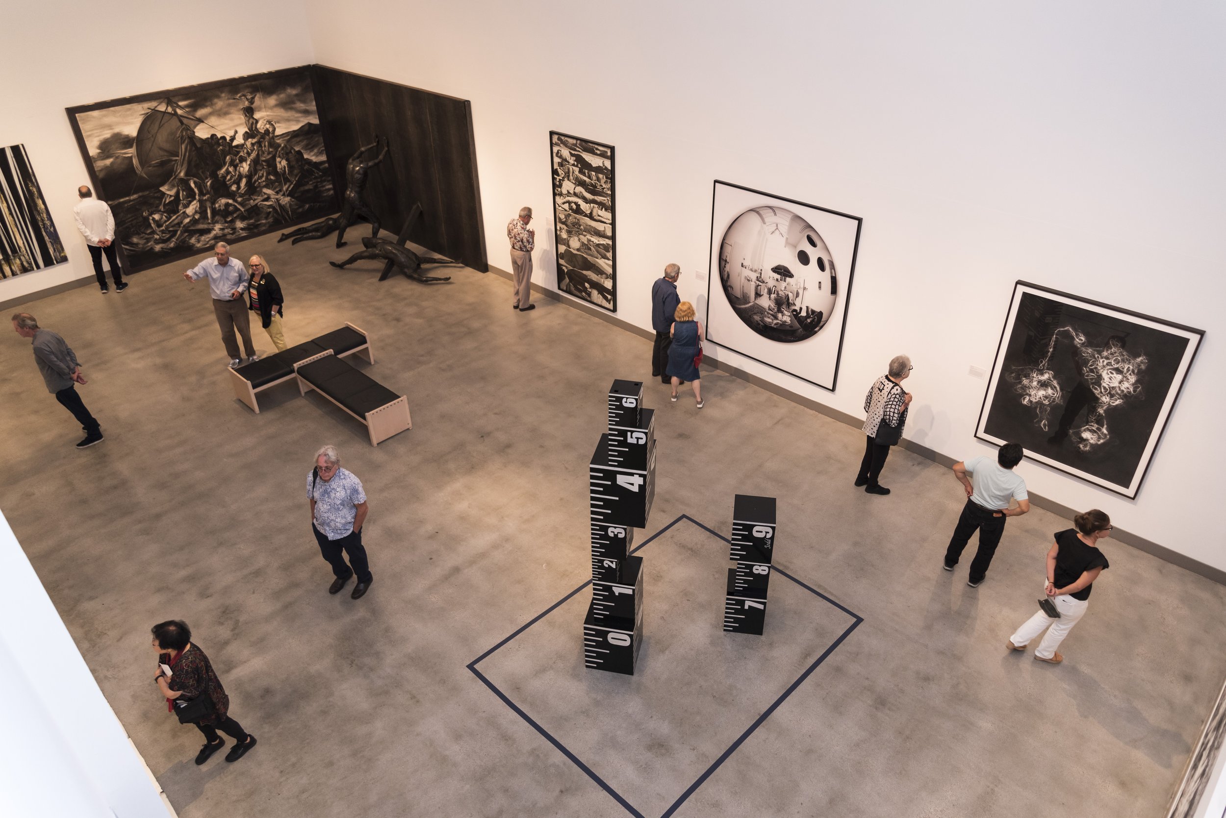
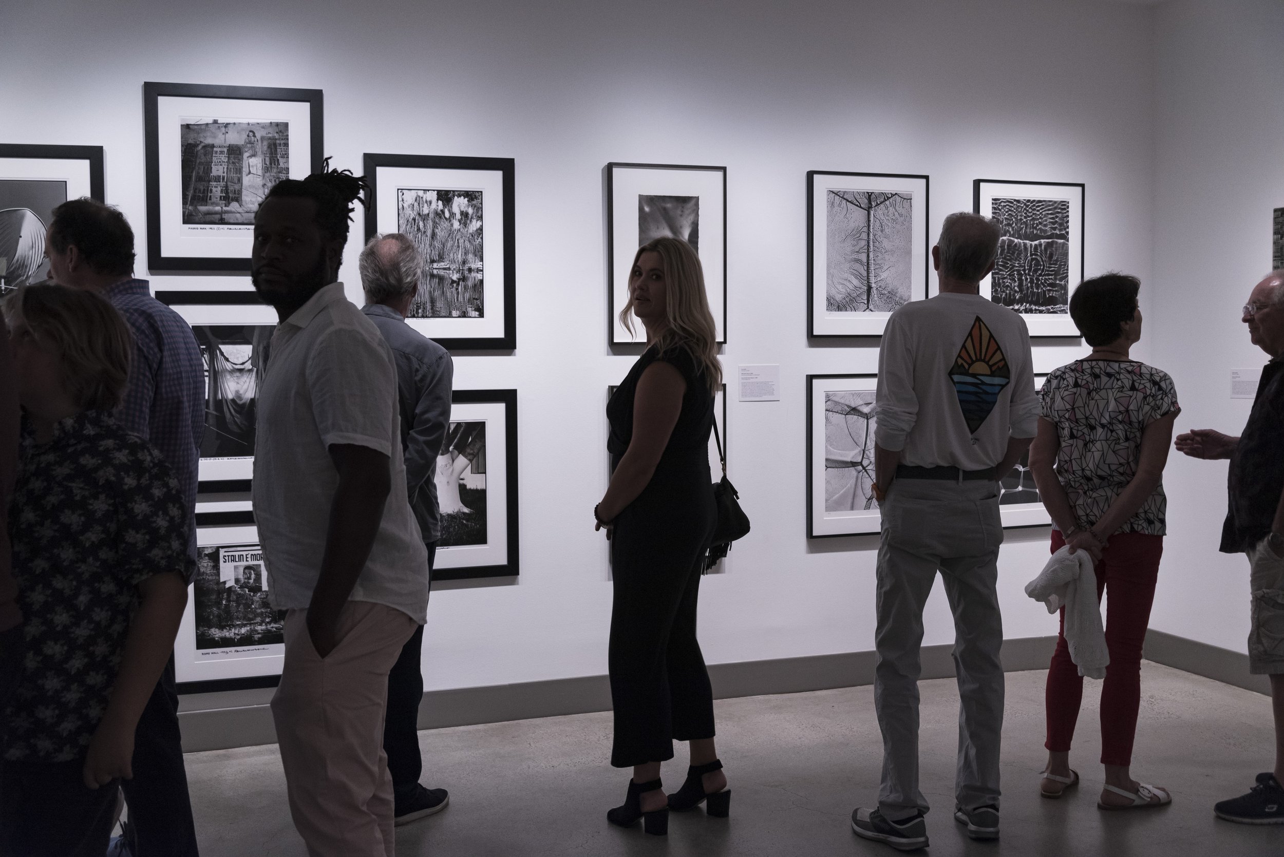
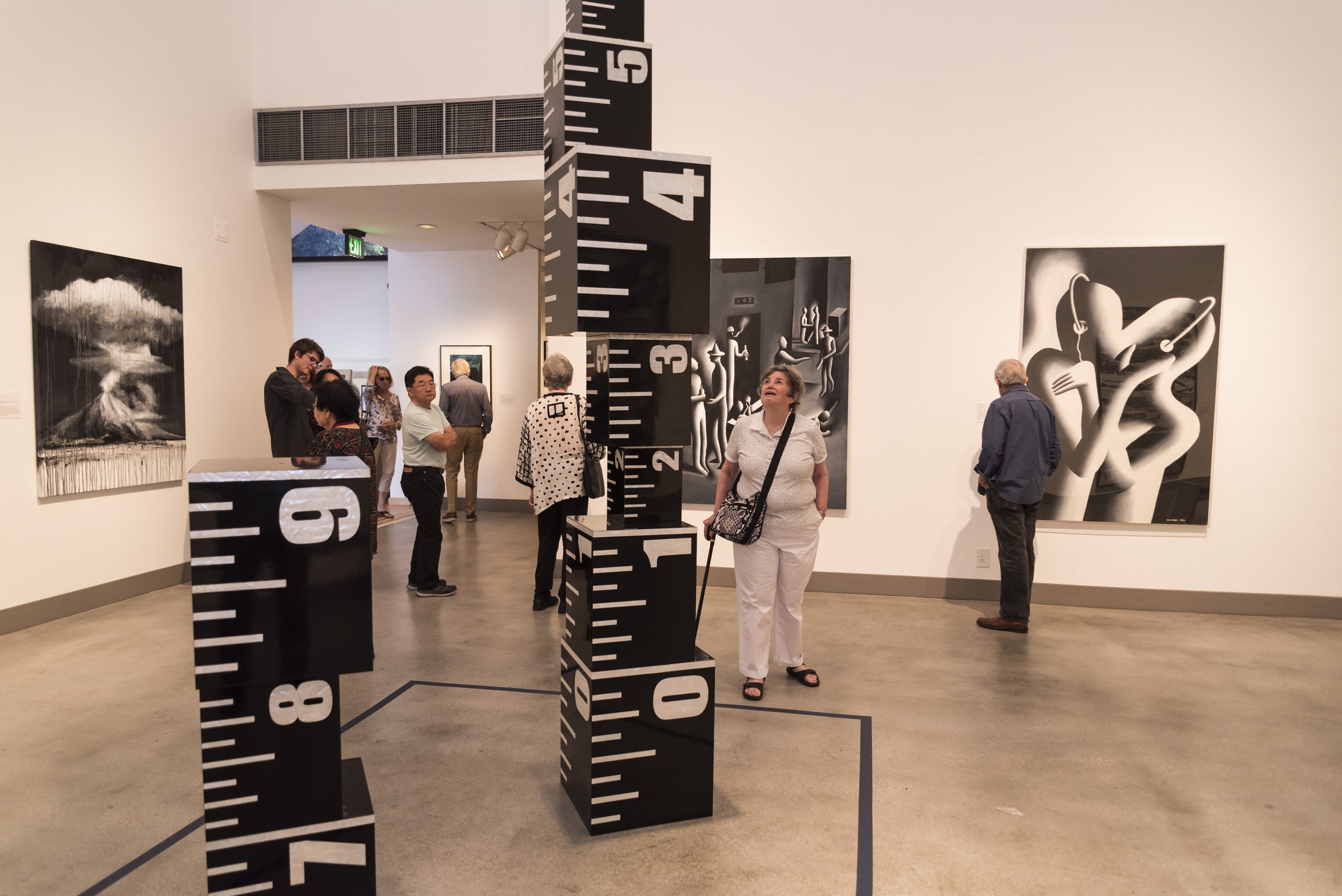
It’s All Black and White: Contemporary Art from the Frederick R. Weisman Art Foundation
This eclectic grouping of contemporary black and white drawings, digital media, photographs, prints, paintings and sculptures are gathered together for this exhibition from the Frederick R. Weisman Art Foundation. In color theory black and white are complete opposites. In scientific terms, where color is determined through the visible spectrum of light, black is the absorption, or absence, of all visible light; and white is the reflection, or presence, of it. When color is determined through pigment, or molecular coloring agents, the reverse is true – black is the presence of all colors, and white is their absence. Given that how we see color is interpreted differently within each of our brains, limiting the palette in this way creates high contrast that has a big impact on the viewer.
Black is visually heavy while white is light and open. Shades of gray between black and white - referred to as grisaille - present the viewer with various visual and psychological effects by using gradation from light to dark. For example, the high contrast of black-on-white, or white-on-black intensifies the viewer's focus on the intended subject or object, while shades of gray are viewed as neutral and stable, heightening detail. Early monochromatic palettes were used by artists to fool the eye into thinking that paintings or drawings were not flat paintings but illusions of marble, stone or plaster reliefs. With the advent of photography, monochromatic works were sometimes inspired by the varying shades of gray or sepia tones in the photograph. As gray moves towards black it becomes mysterious, towards white it becomes dynamic.
This exhibition features works by Lita Albuquerque, Charles Arnoldi, Richard Artschwager, Larry Bell, James Drake, Joe Goode, Andy Moses, Ed Moses, Manfred Muller, Robert Rauschenberg, Andy Warhol, and many others—artists who have explored the formal, conceptual, technical, and material possibilities of black-and-white and "in between."